Site of the Day Teardowns
This section covers only the standout Awwwards and FWA Sites of the Day from January 2026 onward, those scoring 7.60 or higher on Awwwards or 85 points or higher on the FWA. Each report examines the concept, visual design, interaction and front-end build behind the award, with performance and asset data measured in a real browser.
- Reports
- 13
- Awwwards
- 9
- FWA
- 13
- Latest
- 2026.10.12
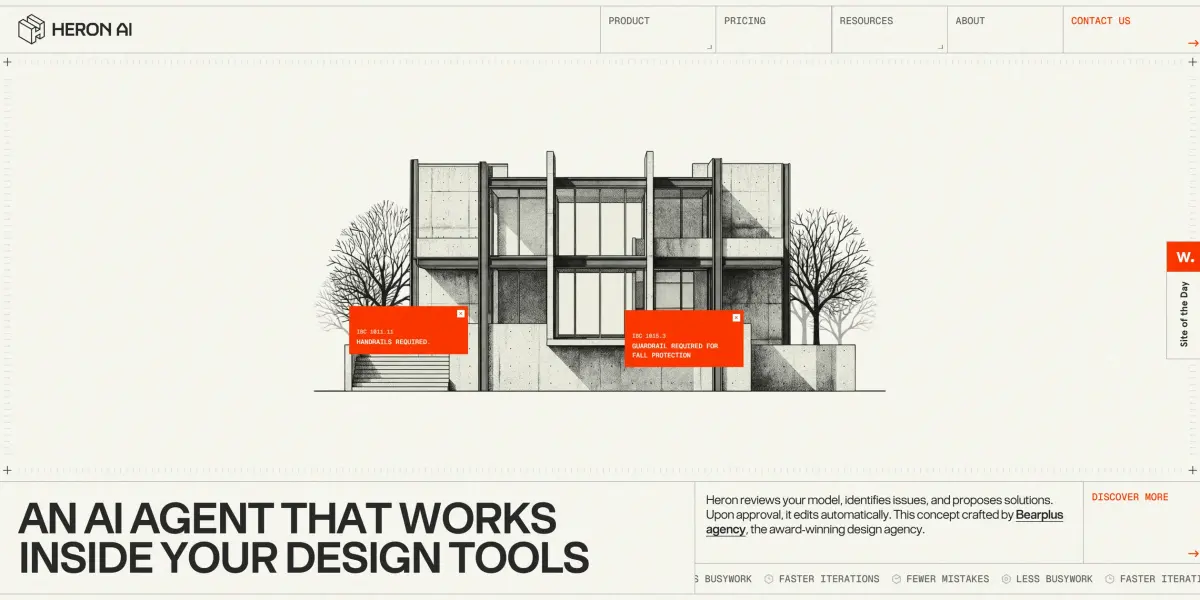
Heron AI
Heron AI is the website the design company Bearplus made for an invented AI assistant that checks architects' drawings, and its home page lets visitors play the checker themselves. The first screen is a house elevation drawn on a sheet of drafting paper, and the cursor drags a pair of crosshairs. When the visitor drags a box around a problem spot on the house, an orange card pops up saying the building code requires a handrail there. In the site's story, Heron sells exactly this, an AI assistant that checks an architect's model and finds such violations, and the home page has visitors do the job first.
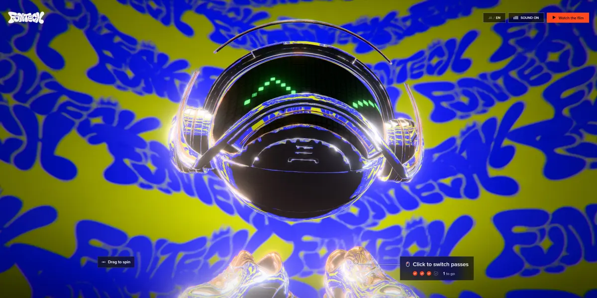
Experience FunTech Creativity
Experience FunTech Creativity is the site the Tokyo studio FunTech made for its 2026 showreel film HELLO, WORLD., and the visitor has to play to move forward. Ten real-time 3D scenes follow one another, and each leaves the visitor something to do. The visitor dresses the mascot Fun-kun in one render layer after another, summons lightning, walks past statues of the staff, and smashes an old computer screen to set it free. Every sound and move on the site lands on the beat of the same 174 BPM track.
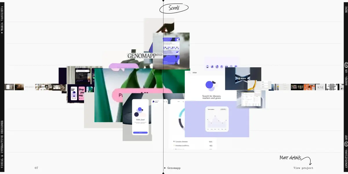
Maria Vasilyeva Portfolio
Maria Vasilyeva Portfolio is the personal portfolio of designer Maria Vasilyeva, and the designer built the whole site as a musical score and a music player. A long strip of project thumbnails sits on the staff lines of the home page, and a playhead walks from the left edge of the screen to the right as the visitor scrolls. Whichever project the playhead reaches, a dozen of its images jump off the line and scatter up and down into a cluster. With sound on, every thumbnail the cursor brushes plays a note, and the four menu words and the eleven projects in the full list each have their own music or ambient sound.
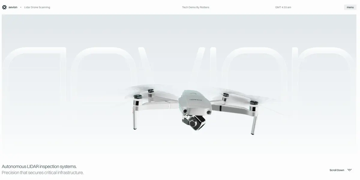
Lidar Drone Scanning
Lidar Drone Scanning is an official site for a drone that does not exist. The Polish studio Riotters invented a lidar inspection drone brand called Aevion and modelled the site on real product sites, running from the hovering airframe and the spec sheet through to the data software. The most convincing part of the page is the 3D terrain map at the end, where a click on a point flies the camera over and opens a panel with a risk level and a confidence figure, like a real inspection report.
Night Drive Racing Game
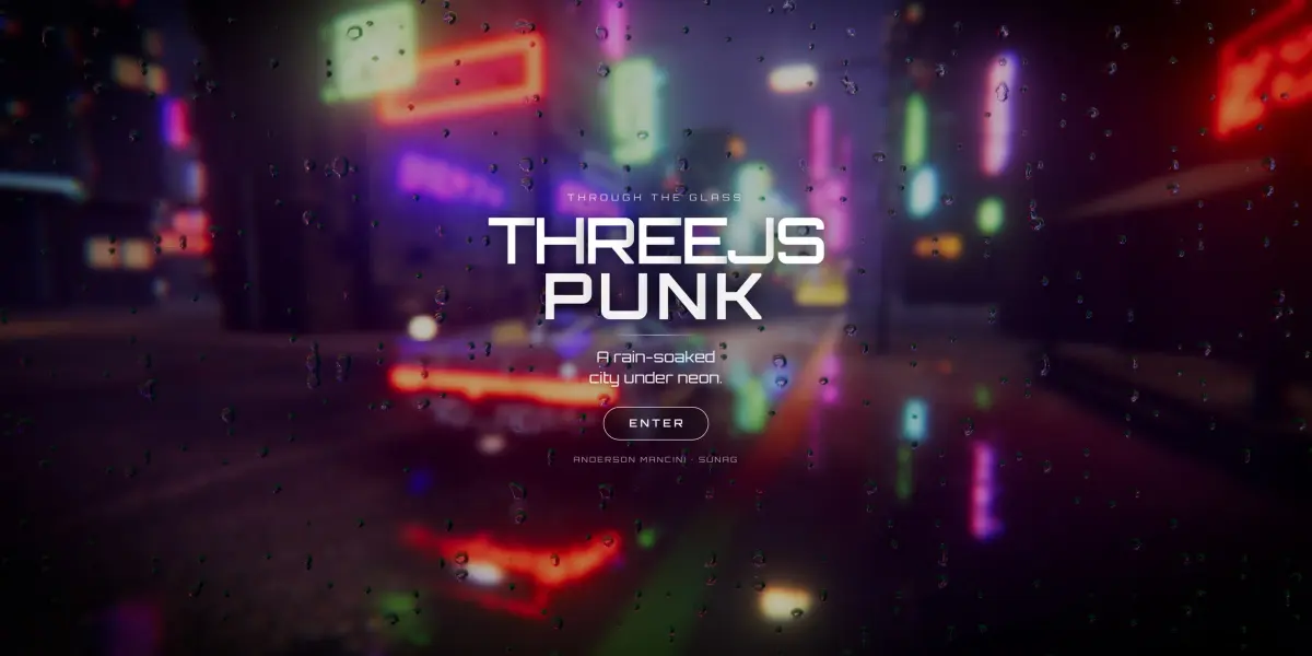
Night Drive Racing Game is a complete open-world racing game on a web page. From one link, the visitor drives a sports car around a rainy neon city where errands, street races and dozens of hidden symbols wait to be found. Players can also leave the car and walk, switch cars in the garage, or join a room and drive with other people. The reflections in the puddles, the raindrops on the bodywork and the water on the lens are all computed live by the graphics card.
Long Hoang Portfolio
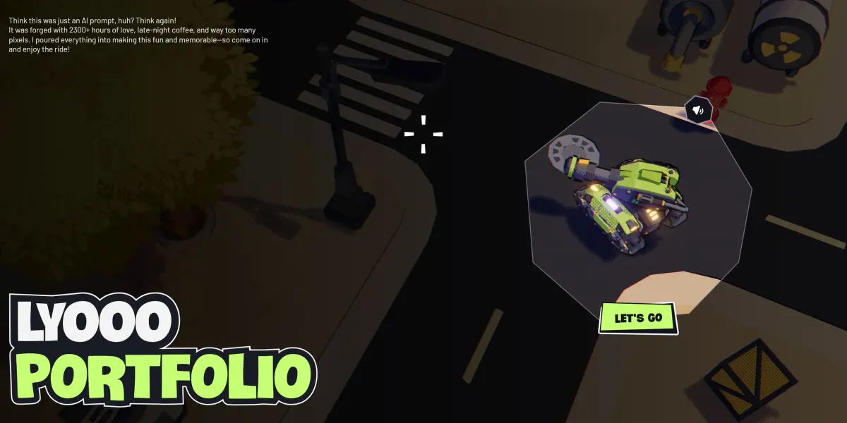
Long Hoang's job-hunting portfolio is a 3D game explored by tank. The visitor drives a small neon-green tank from a tutorial on a grassy hill into a cartoon factory, fights enemies and collects parts, and the five projects sit inside a machine with a screen in the middle of the factory. The whole world is drawn like a comic with halftone dots, hatching and heavy outlines, and the interface is a set of torn-paper panels whose edges never stop trembling. A visitor short on time can press one button at the bottom of the screen and be sent straight to the work.
Jesper Landberg
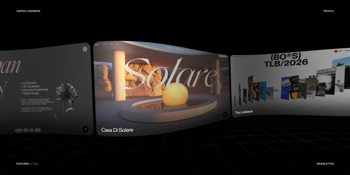
Jesper Landberg's personal portfolio turns the whole web page into a material that can bend, be pushed up and be swallowed by a black hole. The eight featured projects form one curved ribbon, and the faster the visitor scrolls, the more its left end rears toward the camera while the cards on the right wring into thin strips. The cursor acts like a ball rolling under the page and raises a bulge wherever it passes. When the visitor opens PROFILE, a black hole opens in the middle of the page, bends the picture around it into a ring of light, and holds a few black alpacas floating inside.
Léo Parpeix - Portfolio 2026
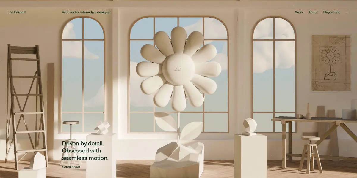
Léo Parpeix's portfolio opens as a 3D sculptor's workshop that visitors can walk into. On a plinth in the middle of the room stands a plaster daisy with a face, and the same flower's design drawing hangs on the wall to the right. The finished piece and its plan share one frame, so visitors see the result and the process behind it the moment they arrive. The moustached daisy runs through the whole site, and on the About page it becomes a giant real flower in a pot on a wooden deck by a lake.

No Mercy Michel
No Mercy Michel is a browser arm-wrestling game by the Paris studio Merci-Michel, and the visitor's opponents are the studio's own staff. The match tests nothing but who clicks fastest, yet the camera, the crowd, the music and the colour of the picture all react to the score in real time, turning a few seconds of clicking into a televised boxing bout. A win earns a ring, a watch or a tattoo worn on the visitor's own arm, and a loss takes those things back.
Gil Huybrecht
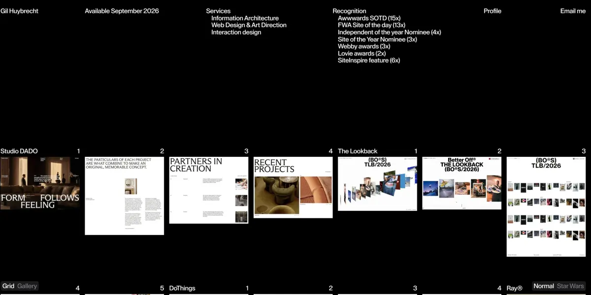
The portfolio of Belgian designer Gil Huybrecht lays every screenshot from 19 projects out as one wall on a black page, and each of them is drawn on the same full-screen canvas (an area of a web page set aside for drawing images). That is why one image can fly from the grid into a project, into a different arrangement of the work, or up to the middle of the screen. A switch in the bottom right turns the whole site into a Star Wars edition with a blue lightsaber for a cursor, and when visitors swing it across a screenshot, the blade burns a glowing slit into the image.
The Tuscan Journey Begins
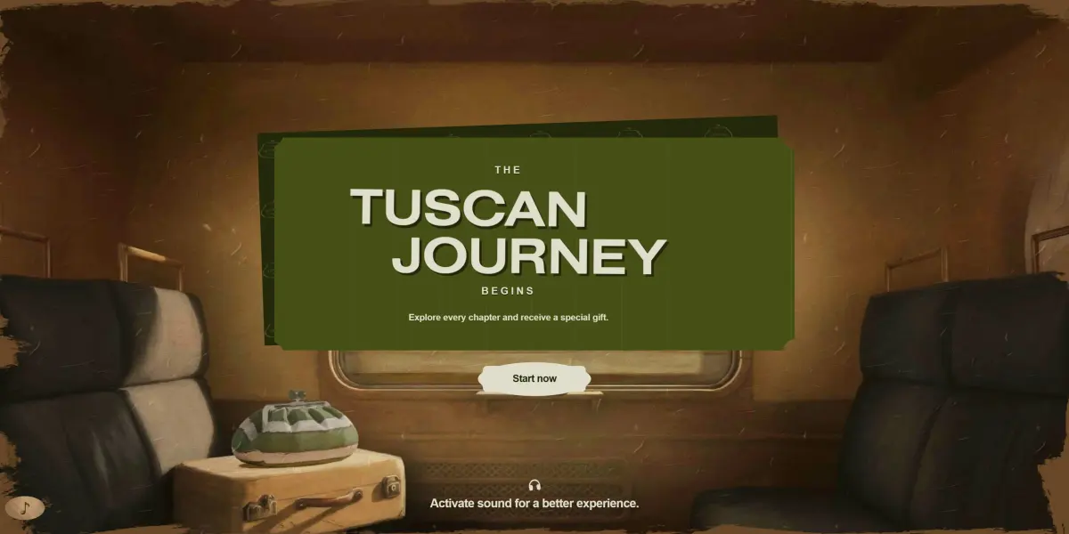
The Tuscan Journey Begins is an interactive site that Weekend Max Mara commissioned for its Pasticcino bag. The Florentine studio MONOGRID painted the three Tuscan crafts behind the bag as a train journey in oils. At each stop the visitor does one step of the work by hand: they browse the fabrics, carve a block of marble into the bead for the clasp, and finally use scissors, a glue pen and the bead to make the bag.